Possible to 'smooth' results - create an average reading?

Hi -

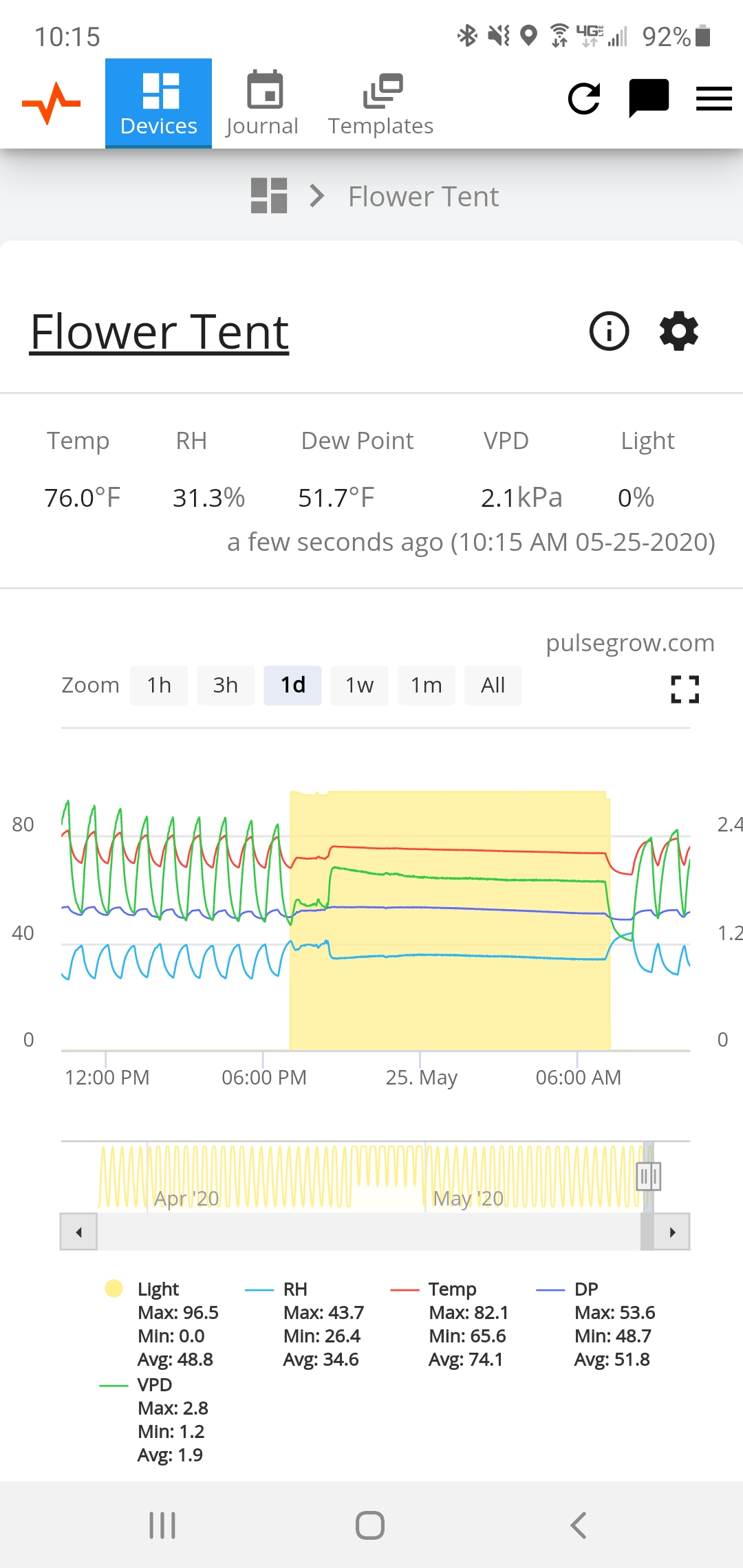
When I use my dehumidifier it comes on and off multiple times creating the sort of graph below.

Is it possible to smooth the curves and deliver an average over vs the very detailed measurements? It’s not a deal breaker, as I can sort of figure it out and there are some calculated averages below, it would just look cleaner.

Loving the Pulse!

Dan

I have a heater in my flower tent for when the lights are off to combat high humidity. I get the same type of graph. Short of just leaving it on rather than cycling, i don’t see a way to smooth it out

1 Like

I think the monitoring software is doing exactly what It’s intended for, I like to see exactly these details for my equipment to notice any changes. It’s the reason I got all my Pulse devices :slight_smile:

(Please don’t change anything Pete!)

3 Likes

Thinking more of a setting to toggle in smoothing if required. Fear not wascanna :slight_smile:

1 Like

I understand where you’re coming from with the desire for a nice looking chart, however things like smoothing are actually misleading. The chart would technically be lying to you. It’s doable, but I don’t personally consider it a valuable thing to keep an eye on.

1 Like

Actually realised that you provide what I need already, just not in a graph. If I focus in on a particular time frame, it’ll give me the numerical min, max, avg for that time period… this is exactly what I was after as really just wanted to see where my averages are at considering the fluctuations on all metrics depending if the heater, exhaust, lights or dehumidifier are on.

1 Like