
The device detail page has a series of buttons used to control the timeline of the data displayed. The current set of values are handy but if it’s late in the day when I show 12 hours, I miss the start of the photoperiod day. Similarly, if I select “1 day”, I see data from the lights out period.
Adding another button to display only the time since the lights went on would provide a more useful display and the statistical summary would be more useful since that data would be from the “day time”.
The day to night/night to day shift is definitely worth taking a look at as it’s the most dramatic shift your garden sees on a daily basis!
That said, we also understand the value of seeing averages specific to lights on and lights off. This data is already available in the app, and is dynamic depending on the time period that you have selected as shown below.
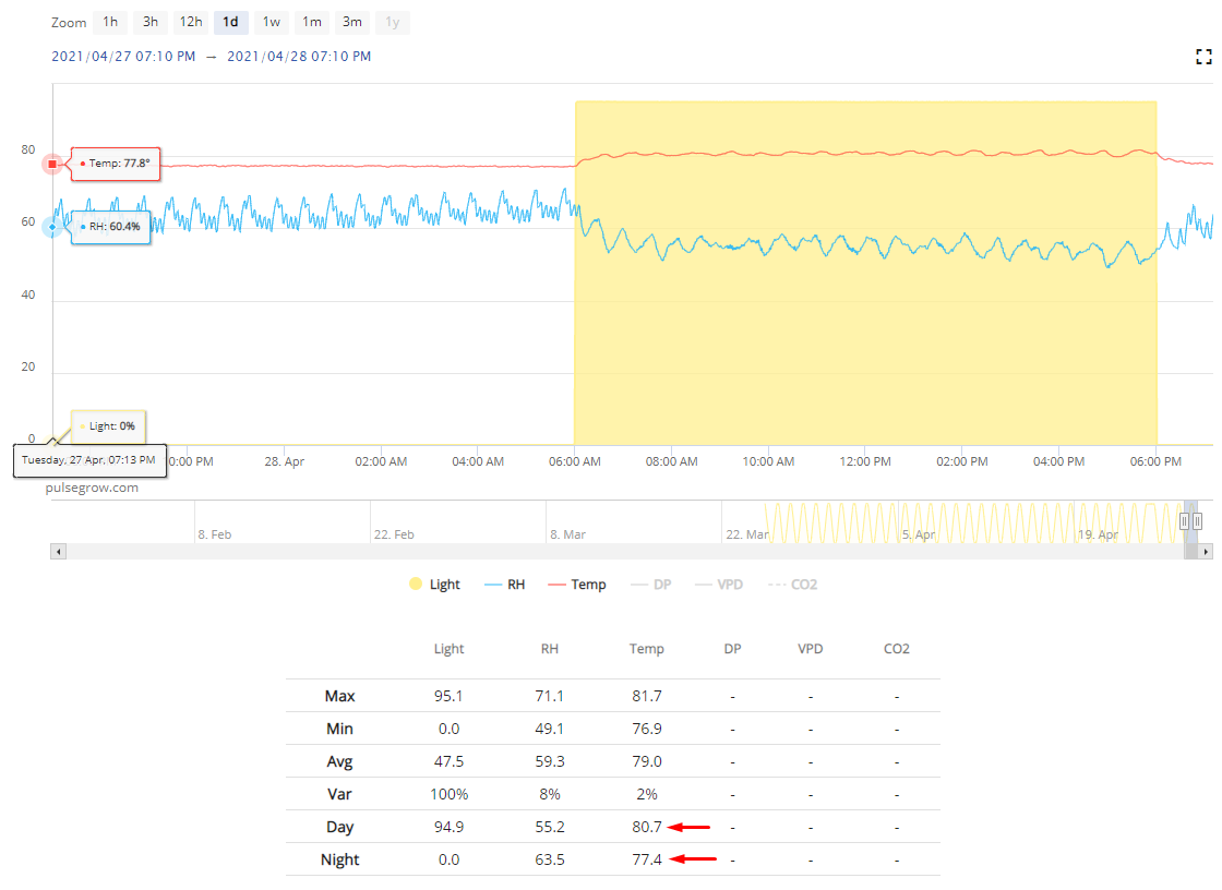
These are the average temps for both day & night for the selected 24h time period.
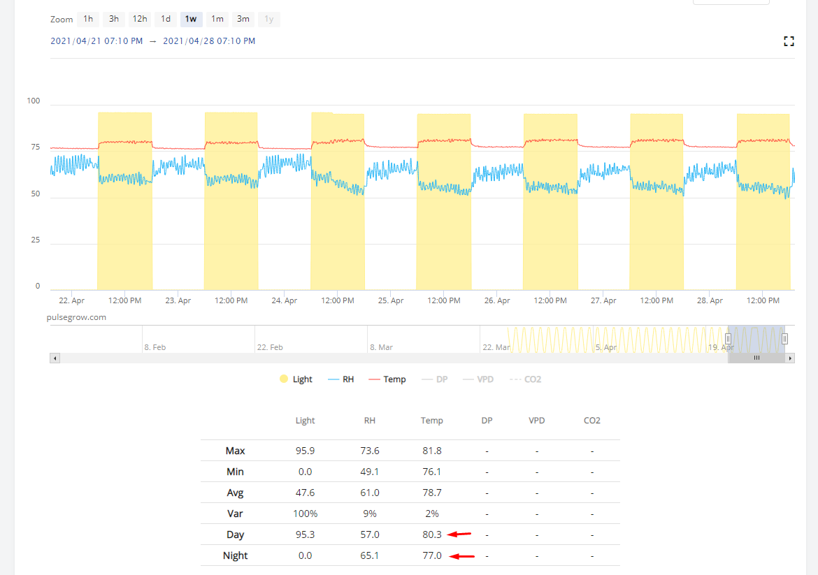
Same device, but for a week of data (showing cumulative day & night averages for that week)
Make sure your photoperiod settings match up with your actual lights on/off time!
Thanks for the reply.
I completely agree . Def annoying when you just want to see the light or dark period and you get stuck between the transition. And when you manually enter a set of time and dates to see a specific area it doesn’t seem to bring up anything other than your preset hour times ( 1,3,6, 12 etc . )
You see the daytime data in the table below already.
I’ll add a task for our engineering team to add another zoom button, but this isn’t super simple unfortunately.