Lower light graph question

Hey all, first and foremost merry Christmas/happy holidays! I hope even with all the s#!t going on everyone managed to find a bit of peace and tranquility over the holidays.

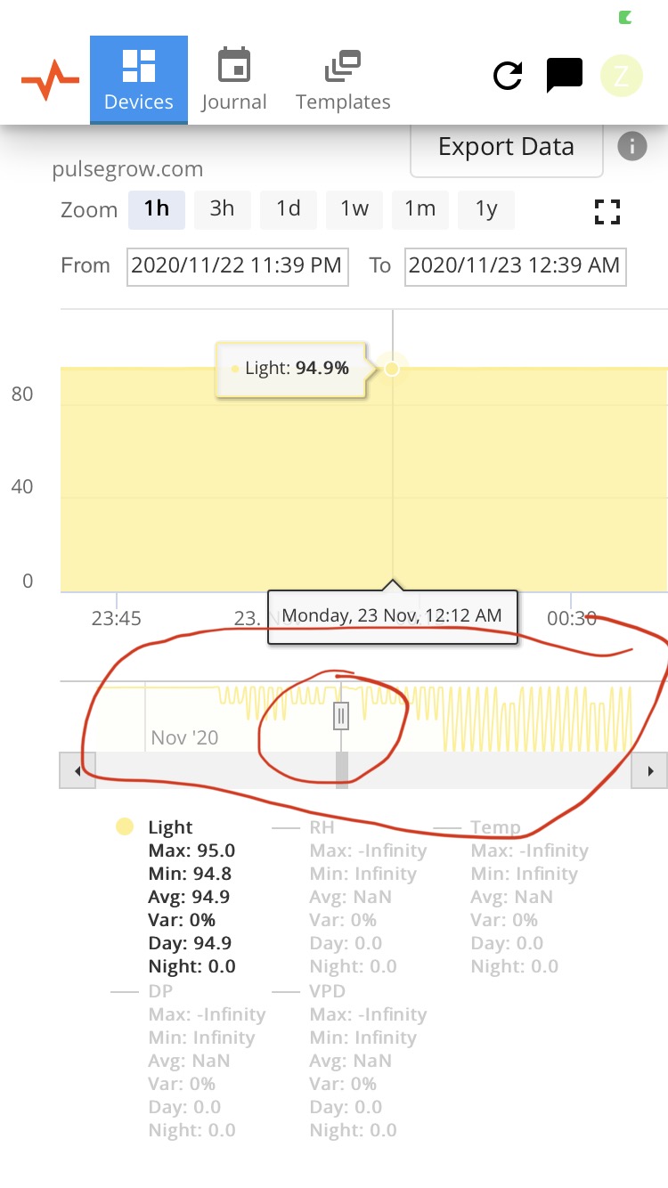
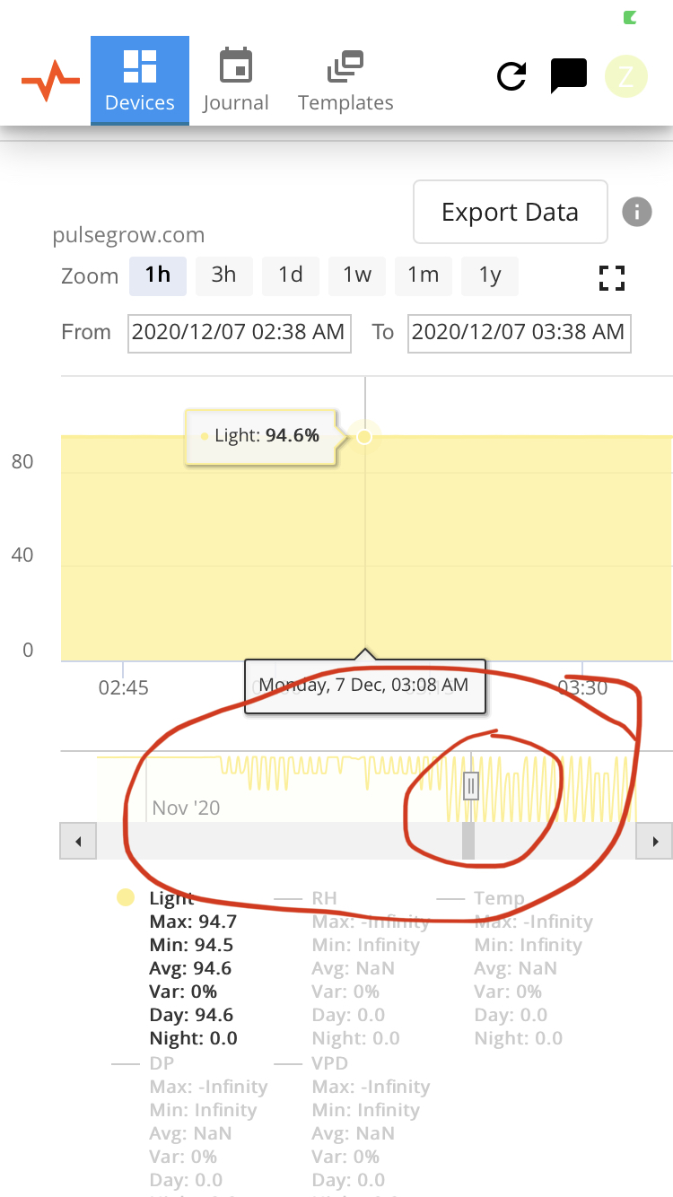
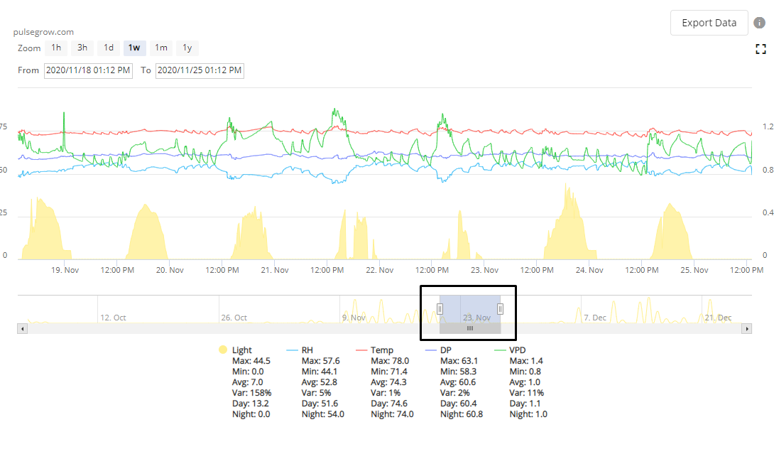
Now just curious I noticed today the light graph that’s underneath the main graph (photos posted). Might be a dumb question but just curious how one would read it? To me it seems like the big spikes and the little spikes both have roughly the same % value on the main graph when I go to them, so what makes it that it spikes higher than other times?

Again merry Christmas and happy holidays and I hope everyone is doing well!

That lower graph is just to help you zoom into different time ranges.

Here i’ve got a week range selected and can drag it around. I can also use the two handles on the ends to expand or reduce the time range in view.

1 Like

Hey Pete thanks for the insight. I’m picking up what you’re laying down about using the bottom bar/graph to change to a different time range. Was more asking specifically about the yellow line(which I’m assuming is related to the “light” sensor and the yellow line on the main graph) within that bottom graph/bar. Is there any information that this other yellow line is telling us? And if so, what causes the difference in size of spikes at different time periods, when the light values on the main graph are identical?

I might be looking to into it and that yellow line might not be giving me any information, but I just figured I’d ask the question to ease my curiosity!

Ah I see what you’re asking. No there isn’t really a difference there in what it’s telling you.

It’s just there because we needed to have a series on that bottom chart due to how the charting tool we’re using works, and light was the series that made the most sense to put there.

1 Like

Right on that’ll help me stop stressing about it :joy: thanks again Peet!

1 Like