Custom graph Y axis min/max

This is a feature that almost all other (retail level) climate controllers lack, but is sorely missing:

The graph should have the ability to set custom ranges for each graphed element. Here is an example of my frustration, and the solution:

Example:
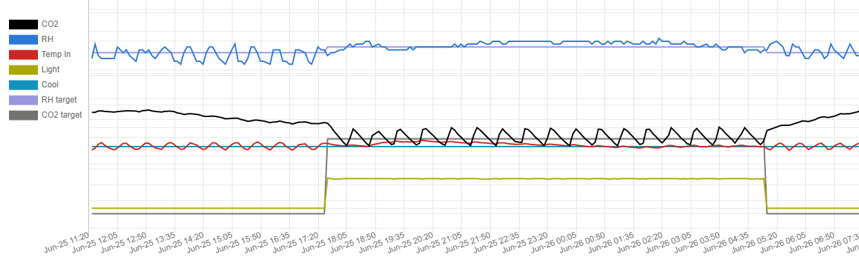
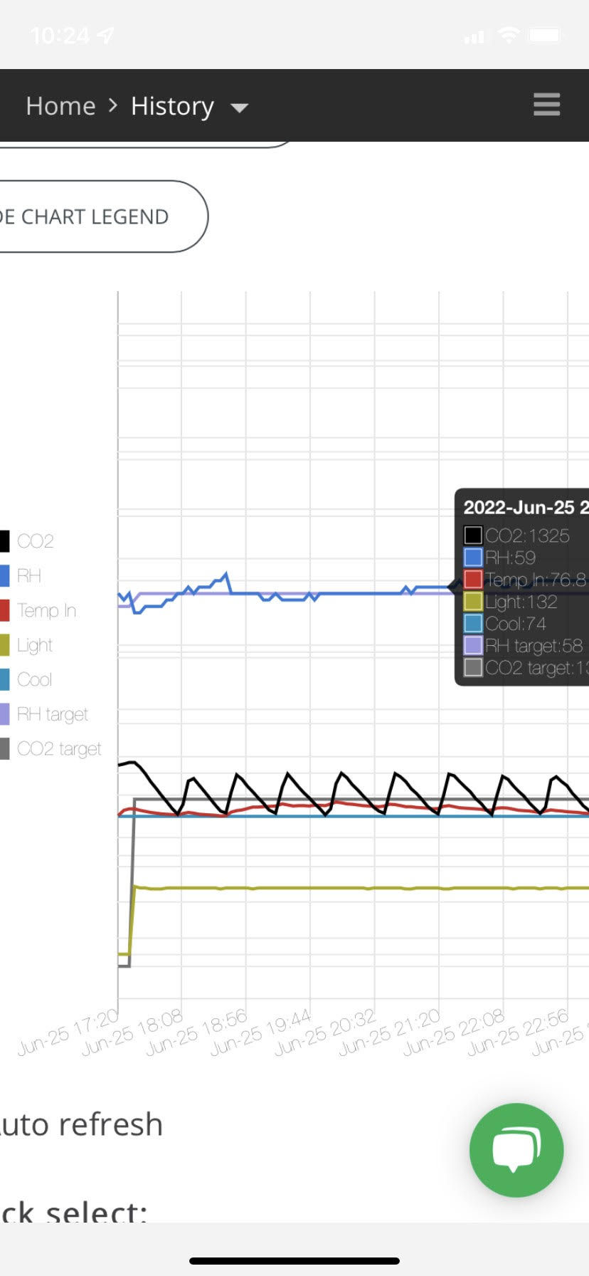
Today according to the pulse, the CO2 was swinging wildly all night long. I thought something must be going wrong. But no, it’s just bouncing back and force between my deadband but the graph is showing CO2 with 1100 at the bottom and 1200 at the top; basically the top and bottom of my deadband.

Another example is that the temperature axis starts at 0! lol. It looks like it’s been straight up level all week when really I’ve changed the temp set point by 5 degrees, in a crop where a few degrees can make a big difference.

Solution:
What a data driven grower often wants to achieve is a flat line and/or an easily identifiable pattern of things being under control. If the graph allowed me to set the CO2 axis to something else (say, 400 to 1500) then instead of wild swings I’d see a mostly flat wave. It would also be nice if I could set my CO2 upper and CO2 lower targets as a marker lines on the graph (to easily see if I stayed in range)

Alternative solution:
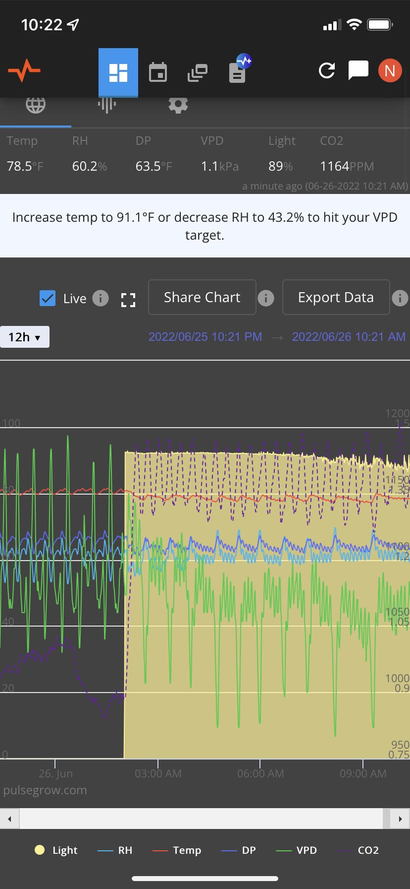
The axis ranges could be intentionally default to more reasonable values according to what people are typically looking for. Temp maybe 60 to 100, CO2 maybe 300-1600, vpd maybe 0 to 2. As it is I’m looking at a mess of squiggly lines. This is not what the graph looks on my controller.

It’s worth mentioning that because of this issue I usually find myself looking at all my other sensors first and only going to the pulse when I need confirmation of something. If you could see a side by side you would understand.

@Noah Welcome to the community, I have a Pulse Pro, and I’m starting my second year using it. Actually I am also starting my second grow, I started growing last year with my son Matthew. After reading your message I’m not sure I understand what you are looking for. The Pulse let’s you set thresholds for out of range alerts. For which you can set min & max on most of the data readings, before you get an alert.
Sounds like you’re talking about something that actually controls all the different climate elements from one device.
With that said, I don’t really think that’s what you are talking about.
What I do know is I really love the Pulse Pro. I only use one other device which only tells me temp, and humidity. It’s actually a climate sensor that is linked in with my home security system, and also gives me threshold alert settings.
Well good luck with what you are looking for.

Thanks
Tom
May Your Plants Dance

I almost forgot, you can post pictures.

Thanks for pointing out it’s possible to post pictures, I’ll do that in a second.

Like you suspected, I’m not talking about setting alarm minimum and maximums. I’m talking about being able to set the graph’s “view” by altering the Y axis range.

For instance, if your CO2 is going between 1000 and 1100, and your graph view is also 1000-1100, then you’ll see your CO2 line going from the bottom of the graph to the top of the graph all day basically scribbling a line across your screen. If the graph view was 400-1800 or something, then you’d see a gentle wave that goes across the middle of the screen. When it’s a gentle wave, then you can easily notice things like spikes, drops, or changes in injection frequency from people being in the room or leaving the door open.

Here’s an example from one of my controllers. Notice how calm things look. This is the web version.

Here is the app version of that same device (I can scroll side to side to see the same range)

Now notice how chaotic the pulse is in comparison:

Note that Pulse is not alone in this issue, it’s common across a lot of retail level sensor devices. For instance, the absolute worst of all is Trolmaster. Note how the graph they provide is 100% useless for anything except providing you with stress:

2 Likes

Lmao at the last example, I understand now, and it makes sense. You got my vote.

Thanks
“May Your Plants Dance”

I was thinking about something like this. The other day I had VPD pretty much be flatlined, and it looked like it was bouncing all over the place…

I’ll see what we can do!

1 Like

What if instead of user specified min/max values, we just limited to how zoomed in a Y-axis could be? A minimum y-axis range.

Like I kinda mentioned in my first post, I think the majority of the problem can be solved by choosing the ranges to things that make typical sense for our use case, or even a few default ranges depending on the current value. These pre-defined ranges can also help to keep lines from stacking on each other, like you see in the example from the other controller that I shared.

So while I think user Ymin/Ymax would be the most nice for me, I think most people would be satisfied if the ranges were adjusted just to minimize the chaos so that they can easily spot issues.

Even the example controller I was showing above doesn’t allow the user to set Y ranges, but whatever ranges their software uses are all pretty usable except for VPD. They chose such a terrible VPD range that it’s only ever a flat line at the bottom of the screen, so I usually disable it.

But yeah, rational Y ranges and even maybe horizontal lines representing target values would be super duper.

2 Likes

The “ranges adjusted to minimize chaos” is like 10x easier, and something we can have out in a matter of days, stay tuned!

Hi Peet, did you ever take a crack at this? I can’t be sure but it seems like the graphs are the same as they’ve been.

We took a look at it, and it wasn’t quite as trivial as I had hoped. It’s still on our road map, but we’re prioritizing other projects currently.

Digging up an old topic here. Squeaky wheel gets the grease.

I still have issues trying to use the graph to notice and debug issues. Take a look at my CO2 variance, which is exceptionally stable at 1%, and yet appears to be massively wavering.

we’ll bump this up in priority

@Noah @Sargentd1 this is done and live!

Hi Pete. What is it that changed? Were default sensible ranges added or is it something else? I can tell my graph looks better than it used to so I’m assuming default ranges were implemented.

The defaults were changed to be a bit more sensible